Design System Deep-Dive

Design System Deep-Dive

Design System Deep-Dive

Creating a Unified Visual Language for INGO

Creating a Unified Visual Language for INGO

TLDR

TLDR

Developed a comprehensive design system for INGO insurance to establish consistency across platforms, improve development efficiency, and enable scaling while maintaining visual coherence. This framework streamlined the UI design process and fostered better collaboration between design and development teams.

Developed a comprehensive design system for INGO insurance to establish consistency across platforms, improve development efficiency, and enable scaling while maintaining visual coherence. This framework streamlined the UI design process and fostered better collaboration between design and development teams.

Challenges and goals

Challenges and goals

Design Inconsistency 

Variations in UI elements across different products created a fragmented user experience

Development Inefficiency

Teams spent excessive time recreating similar components across projects

Scaling Difficulties

New features and platforms required constant redesign rather than leveraging existing patterns

Research

Research

Product and industry analysis

Product and industry analysis

Audited existing products to identify inconsistencies and common patterns

Audited existing products to identify inconsistencies and common patterns

Studied successful design systems from industry leaders

Studied successful design systems from industry leaders

Gathered feedback from both design and development teams about current workflow pain points

Gathered feedback from both design and development teams about current workflow pain points

Core Foundational Elements

Core Foundational Elements

Color System

Color System

Developed a flexible color system with primary, secondary, and accent colors

Developed a flexible color system with primary, secondary, and accent colors

Created contextual variations for different use cases

Created contextual variations for different use cases

Established clear guidelines for color application to maintain accessibility standards

Established clear guidelines for color application to maintain accessibility standards

Grid Framework

Grid Framework

Implemented a 12-column grid system optimized for responsive design

Implemented a 12-column grid system optimized for responsive design

Defined breakpoints for various device sizes

Defined breakpoints for various device sizes

Created documentation for proper implementation across platforms

Created documentation for proper implementation across platforms

Typography

Typography

Selected Proxima Nova as the primary typeface for its versatility and readability

Selected Proxima Nova as the primary typeface for its versatility and readability

Established a clear type scale with defined sizes, weights, and line heights

Established a clear type scale with defined sizes, weights, and line heights

Created usage guidelines for maintaining proper text hierarchy

Created usage guidelines for maintaining proper text hierarchy

Iconography

Iconography

Designed a consistent icon library with unified visual style

Designed a consistent icon library with unified visual style

Established guidelines for icon sizing and spacing

Established guidelines for icon sizing and spacing

Created both filled and outlined variations for different contexts

Created both filled and outlined variations for different contexts

Component Library

Component Library

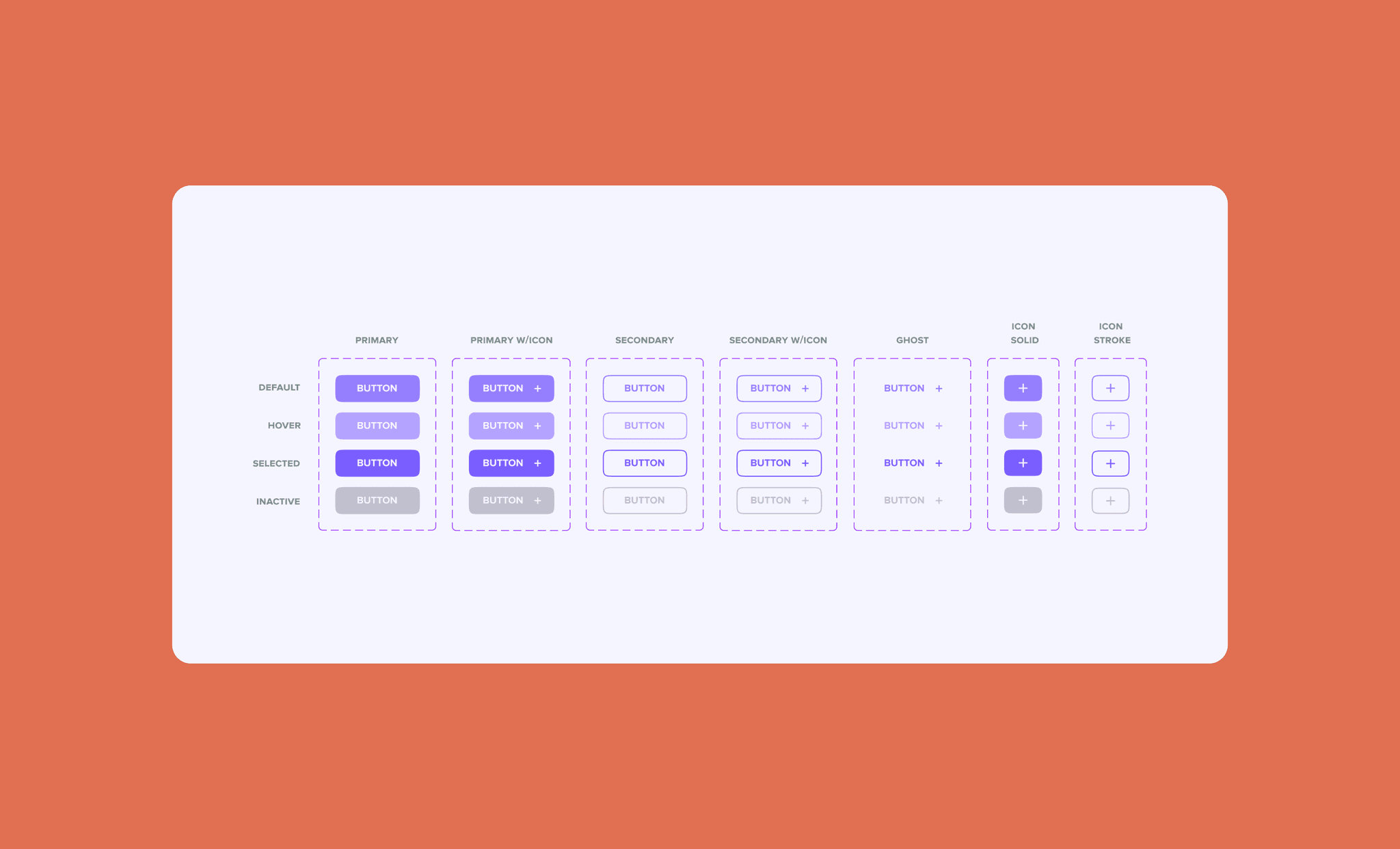
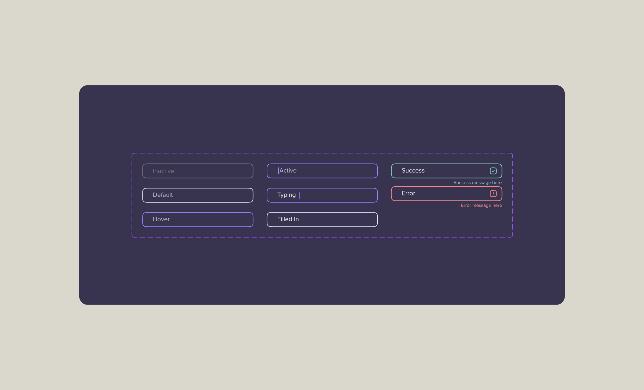
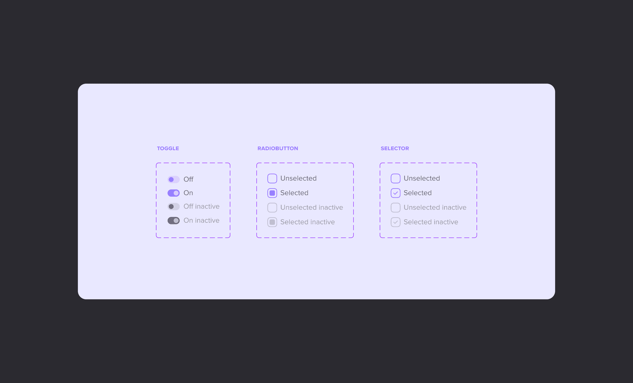
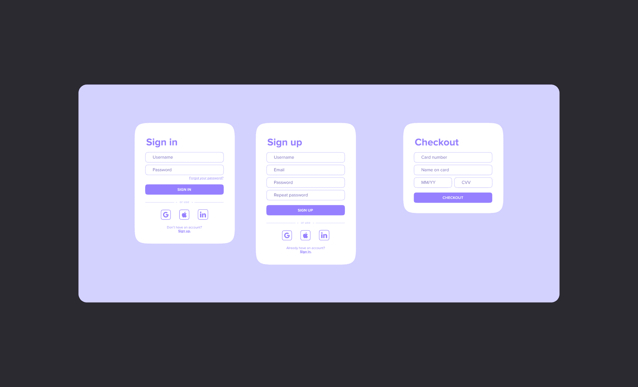
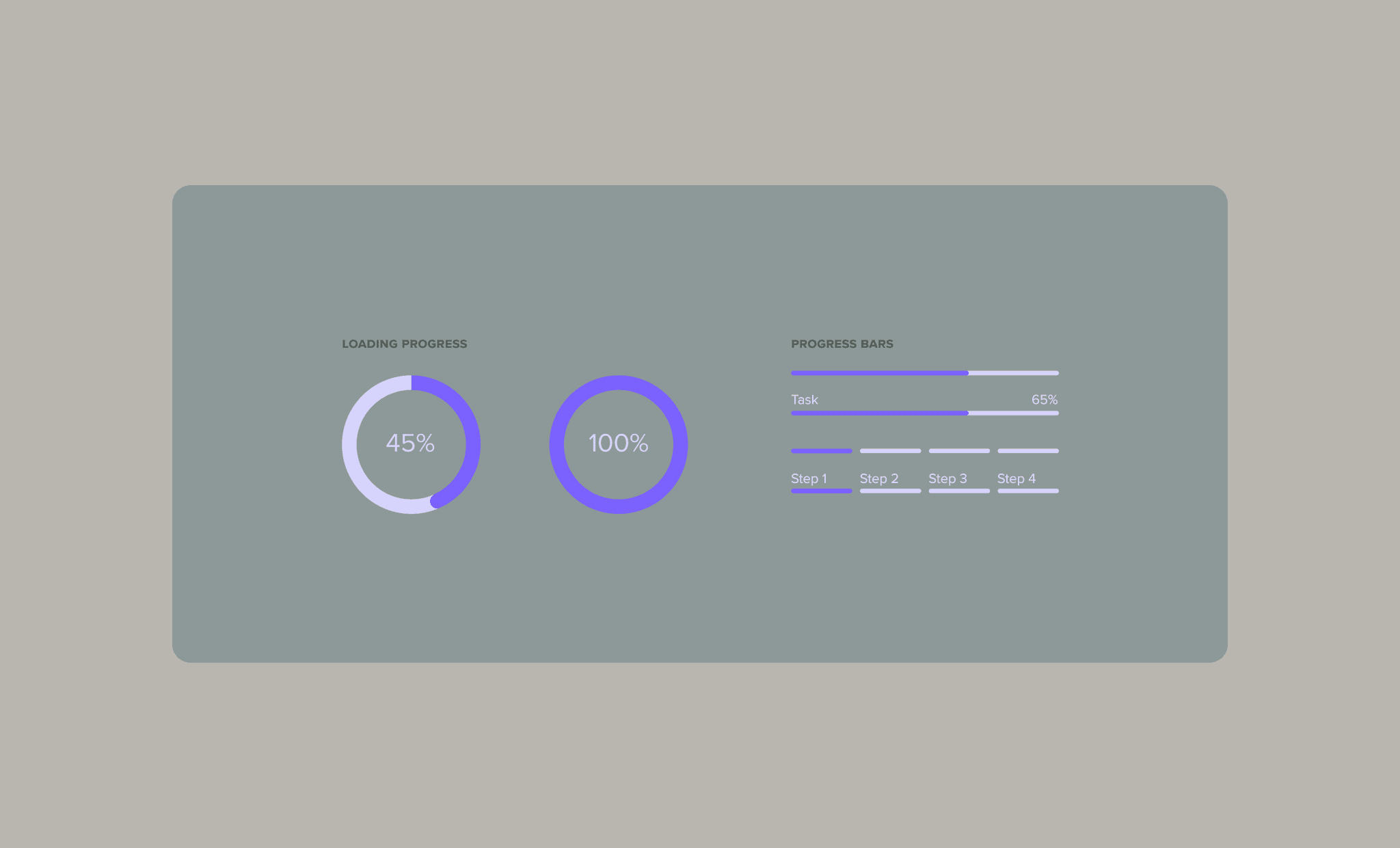
Interactive Elements

Developed a comprehensive button system with clear states
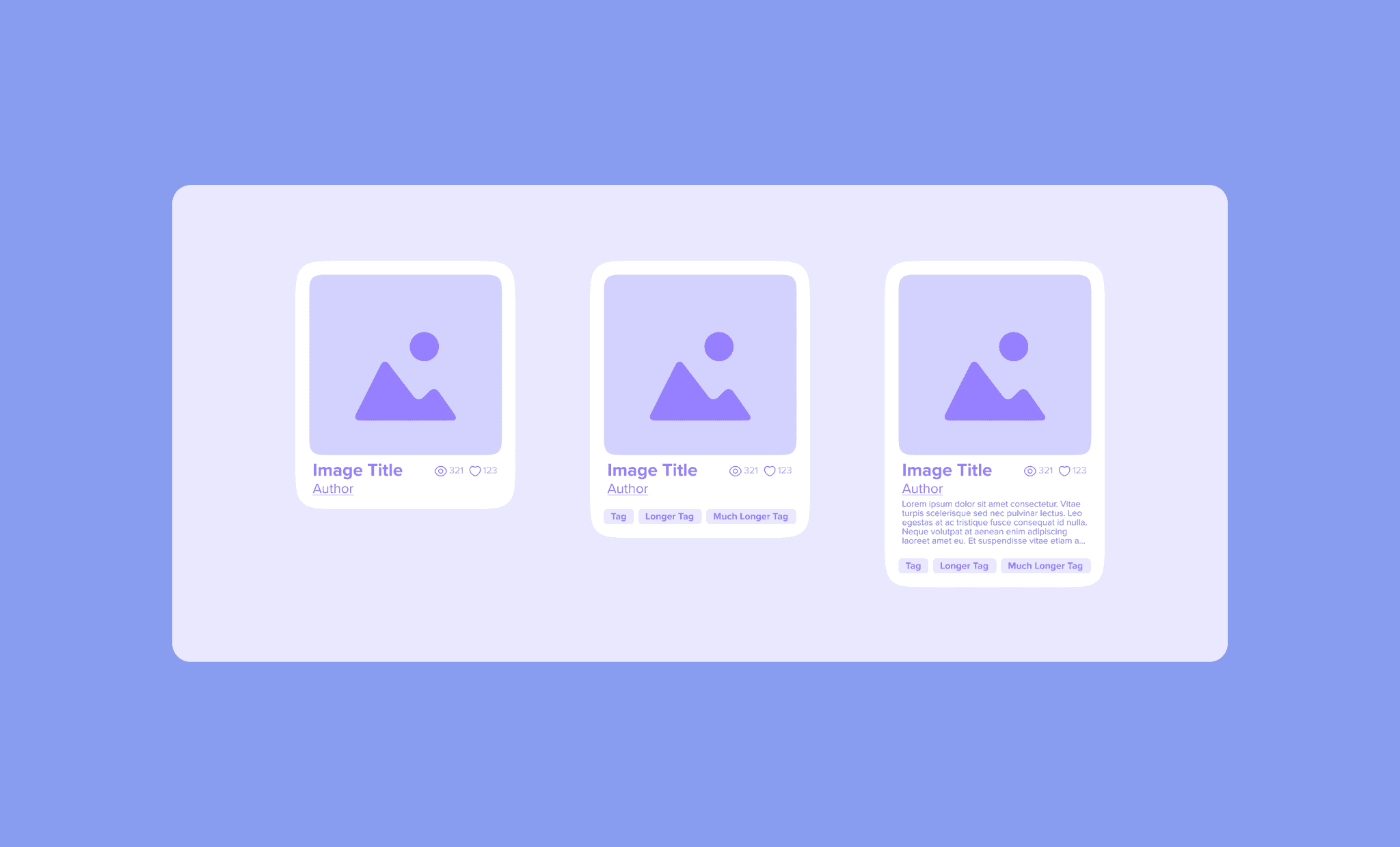
Created consistent input fields with validation states

Created consistent input fields with validation states

Designed toggles and selectors for various interaction patterns

Designed toggles and selectors for various interaction patterns

Content Containers

Developed image card templates with various layout options
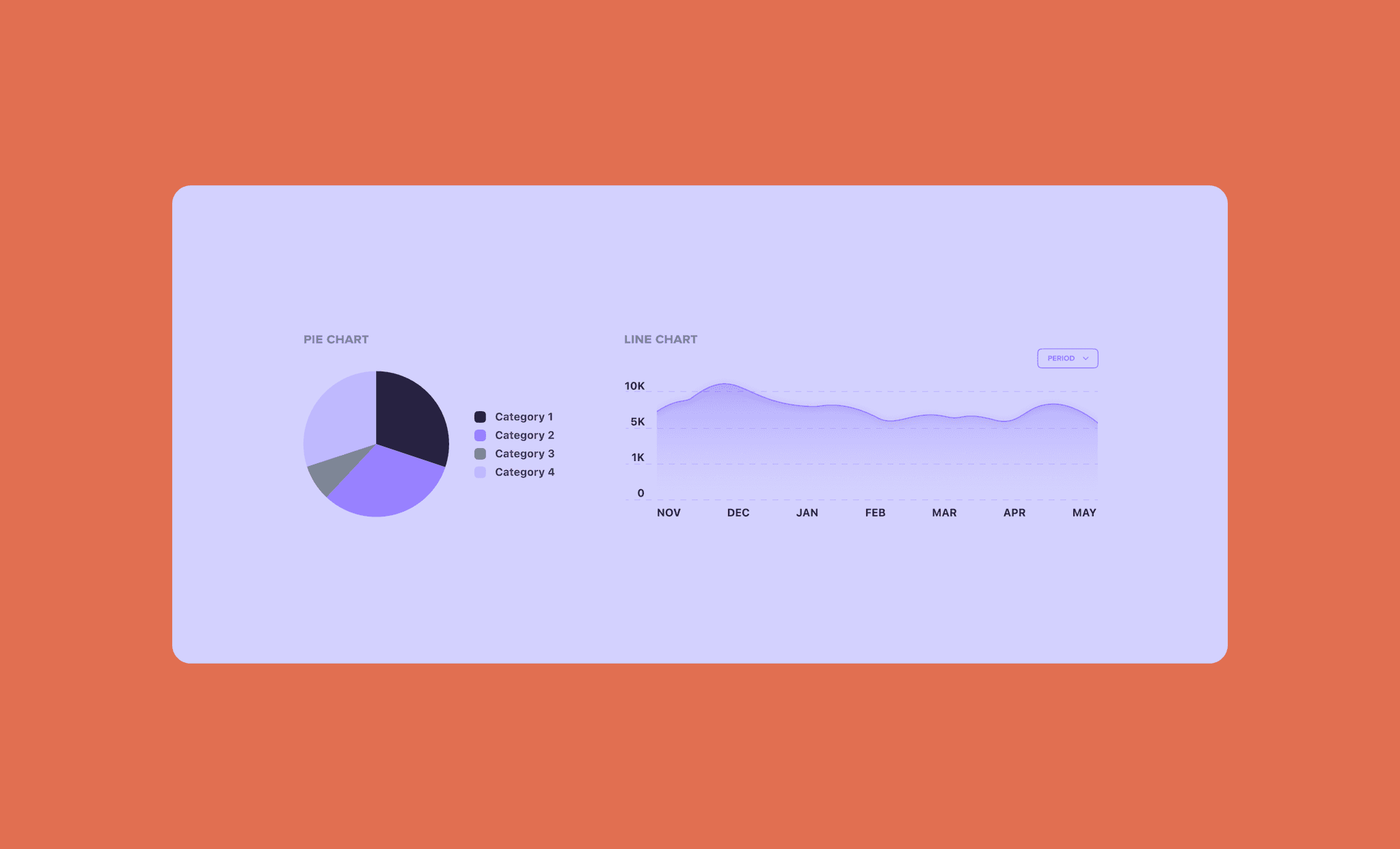
Created form structures with consistent styling and behavior

Created form structures with consistent styling and behavior

Data Visualization

Designed chart components with customizable styles

Created loading and progress indicators for system feedback

Created loading and progress indicators for system feedback

Key Insights

Key Insights

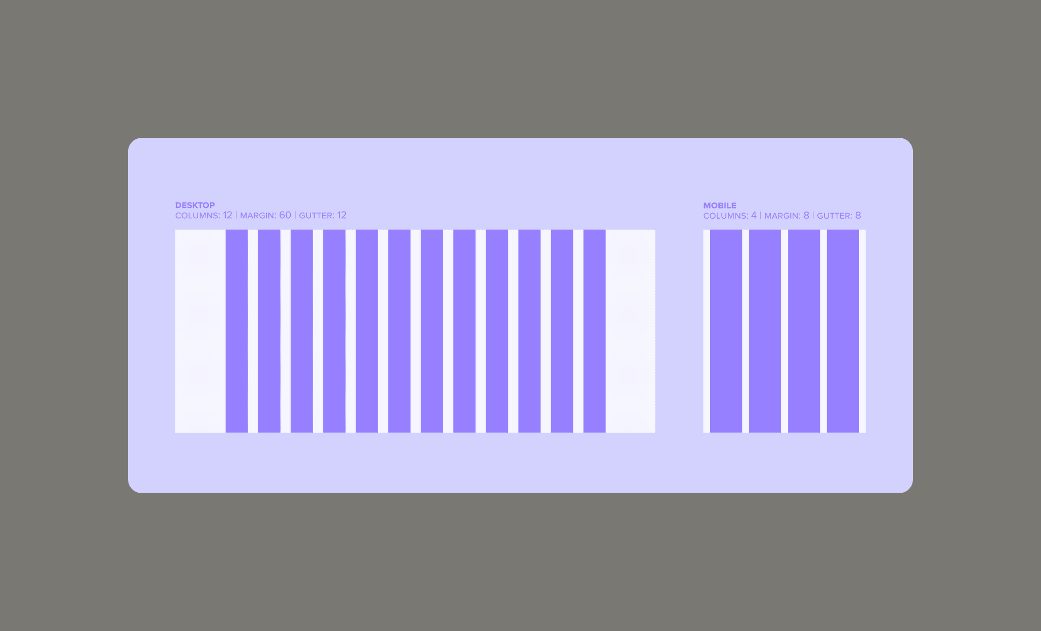
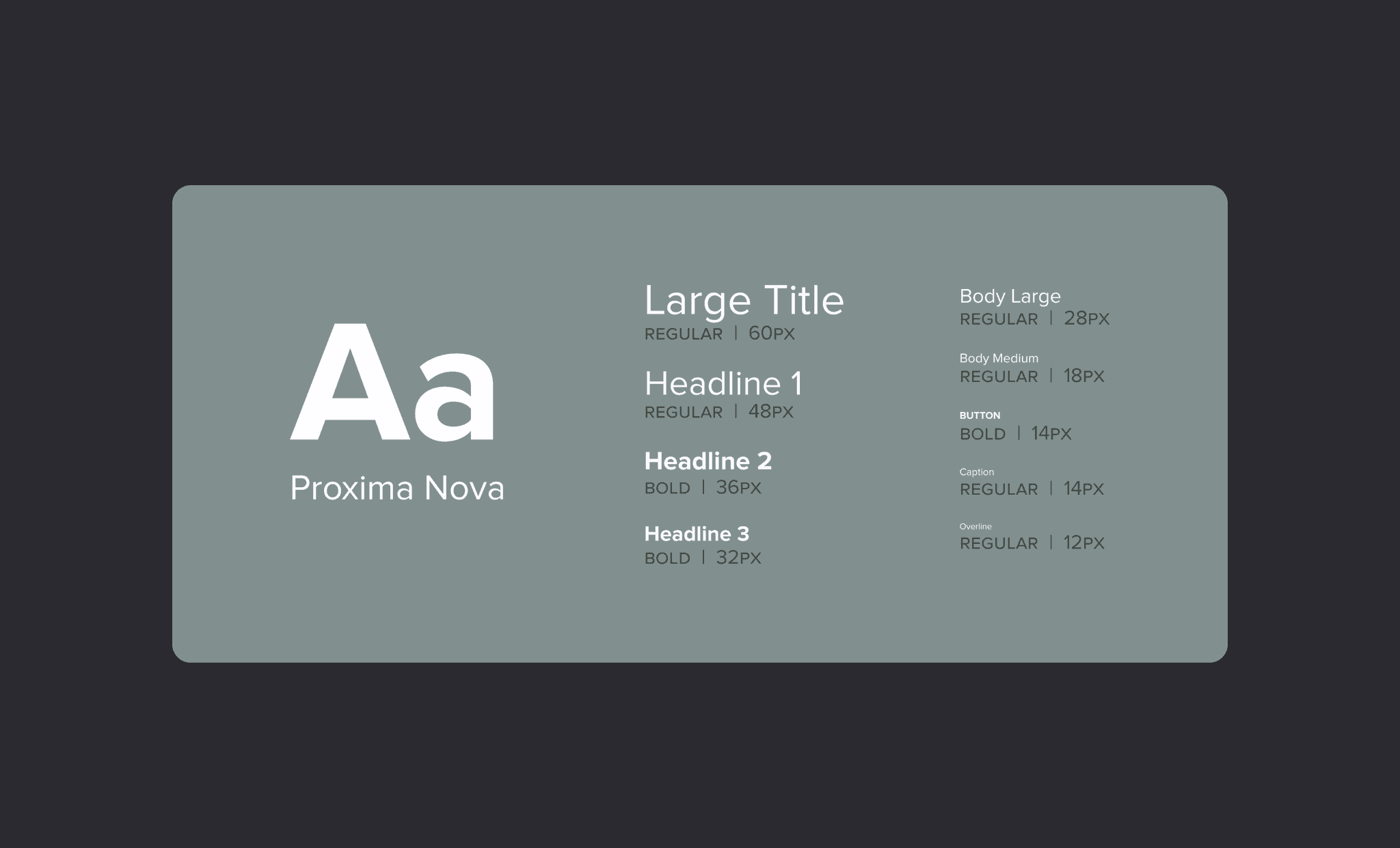
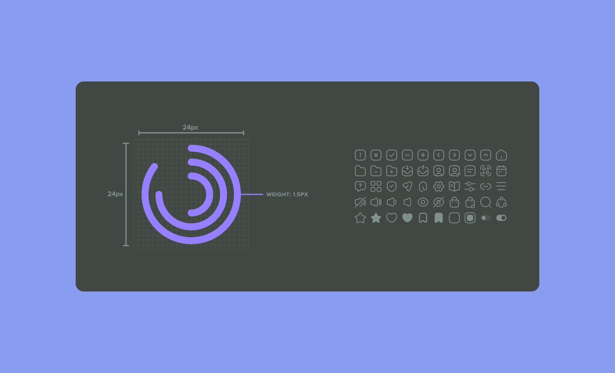
Balance between flexibility and consistency is crucial for adoption across different product needs

Documentation is as important as the components themselves for successful implementation

Collaboration between design and development early in the process leads to more implementable solutions